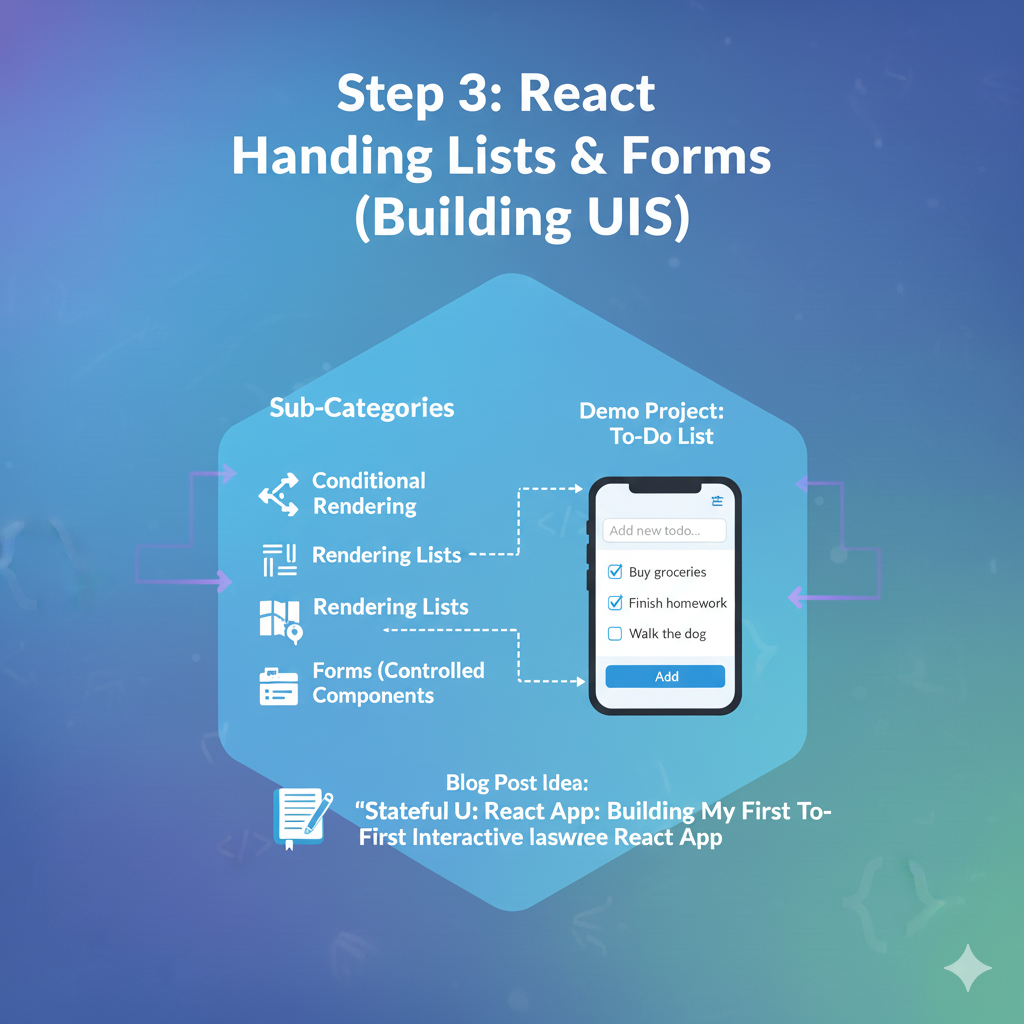
1. 🧠 Key Concept: Conditional Rendering
Your components often need to show different things based on different conditions.
- Is the user logged in? Show
<UserProfile />. If not, show<LoginForm />. - Is the data loading? Show a
<Spinner />. If not, show the<Data />. - Is the list empty? Show “No items.” If not, show the list.
This isn’t a special React feature, but rather a pattern of using plain JavaScript logic inside your JSX.
How to Do It (Two Main Ways)
a) The Ternary Operator (condition ? ... : ...)
This is the most common way to do a simple if/else check inline inside your JSX. It’s perfect for “A or B” logic.
- Syntax:
(condition ? <JsxIfTrue /> : <JsxIfFalse />)
Let’s imagine we have an items array. We want to show a message if it’s empty.
JavaScript
// Inside your component's return
<div>
  <h1>My List</h1>
  {items.length === 0 ? (
    <p>Sorry, your list is empty.</p>
  ) : (
    <p>You have {items.length} items.</p>
  )}
</div>
b) The Logical AND Operator (condition && ...)
This is a JavaScript shortcut that is perfect for “A or Nothing” logic. You want to show something only if the condition is true, and show nothing if it’s false.
It works because in JavaScript, true && <Expression> always evaluates to <Expression>, but false && <Expression> evaluates to false (and React knows not to render false).
- Syntax:
(condition && <JsxToShow />)
Let’s show an error message, but only if an error exists.
JavaScript
// Assume you have a state: const [error, setError] = useState(null);
<div>
  {/* This <p> tag will ONLY be rendered if 'error' is a truthy value */}
  {error && <p className="error-message">{error}</p>}

  {/* Your main content */}
</div>
We will use this in our to-do list to show a “No to-dos yet” message.
2. 🧠 Key Concept: Rendering Lists
You will almost never write out lists by hand in React. Your data will come as an array, and you’ll need to render a component for each item in that array.
The wrong way is to use a for loop. You cannot use for loops inside JSX.
The right way is to use the built-in JavaScript array method .map(), which you learned in Step 0.
The .map() method transforms an array of data into an array of React elements (JSX).
JavaScript
// Your array of data
const fruits = ["Apple", "Orange", "Banana"];

// ... inside your component's return
<ul>
  {/* .map() will loop over 'fruits'
    For each 'fruit', it will run the function
    and return a new <li> element
  */}
  {fruits.map((fruit) => {
    return <li>{fruit}</li>;
  })}
</ul>
This will render:
<li>Apple</li><li>Orange</li><li>Banana</li>
The key Prop: A Critical Rule
There’s one mandatory addition to this. When you render a list, you must give each item a special key prop.
What is it? A key is a unique, stable string or number that identifies each item in the list to React.
Why? React uses the key to track each item. If you add, remove, or re-order items, React uses the key to figure out which item changed, moved, or was deleted. Without a key, React gets confused and might rebuild the entire list from scratch, which is very slow and can cause bugs.
What to use as a key?
- Best: A unique ID from your data, like
user.id,post.id, ortodo.id. - Okay (for demos): A unique, stable value like the item’s text, if you know it’s unique.
- Bad (Avoid!): The array
index. Usingindexas a key (map((item, index) => <li key={index}>...) is an anti-pattern. If the list is re-sorted, the indexes change, and React will be tricked into thinking every item has changed, defeating the entire purpose of thekey.
Here is the correct way, assuming our data is an array of objects:
JavaScript
// Your array of *objects*
const todos = [
  { id: 'abc', text: 'Learn React' },
  { id: 'def', text: 'Build a project' },
  { id: 'ghi', text: 'Write a blog post' }
];

// ... inside your component's return
<ul>
  {todos.map((todo) => {
    {/* The key is for React. It doesn't get passed to your component. */}
    return <li key={todo.id}>{todo.text}</li>;
  })}
</ul>
3. 🧠 Key Concept: Handling Forms (“Controlled Components”)
This is the most important concept in this step. A “Controlled Component” is the standard React way to handle user input from forms.
The “control” means that React state (from useState) is the single source of truth for the input’s value.
This creates a two-way data flow:
- State -> Input: The input’s
valueprop is set from your state. - Input -> State: When the user types, the input’s
onChangeevent fires, which you use to update your state.
On every single keystroke, this loop happens:
- User types a letter.
onChangeevent fires.- Your event handler function calls
setInputValue(e.target.value). - The state is updated with the new text.
- React re-renders the component.
- The
<input>‘svalueprop is set to the new value from state.
It sounds complex, but it’s a simple, powerful pattern.
Finally, you wrap your inputs in a <form> element and listen for the onSubmit event. Inside your onSubmit handler, you must call event.preventDefault() to stop the browser from doing a full-page reload.
2. 🚀 Demo Project: Basic To-Do List
Let’s combine all three concepts.
Coding Steps:
Step 1: Set up App.jsx Open src/App.jsx (you can clear out the Counter or Data Fetcher code).
JavaScript
// src/App.jsx
import { useState } from 'react';
import './MyStyles.css'; // We'll add styles to this file

function App() {
  // 1. State for the list of todos
  // This time, state is an ARRAY of objects
  const [todos, setTodos] = useState([
    { id: 1, text: "Learn React Fundamentals" },
    { id: 2, text: "Understand State and Props" }
  ]);

  // 2. State for the user's current input
  // This state will be "controlled" by the input field
  const [inputValue, setInputValue] = useState("");

  // 3. Form submission handler
  function handleSubmit(event) {
    // PREVENT the default form behavior (page reload)
    event.preventDefault();

    // Basic validation: don't add empty todos
    if (inputValue.trim() === "") {
      return;
    }

    // Create a new todo object
    const newTodo = {
      // Use a timestamp for a simple, unique-ish ID
      id: Date.now(),
      text: inputValue
    };

    // Update the todos array state
    // We use the spread operator (...) to create a NEW array
    // containing all the old todos, plus the new one
    setTodos([...todos, newTodo]);

    // Clear the input box after submission
    setInputValue("");
  }

  return (
    <div className="todo-app">
      <h1>My To-Do List</h1>

      {/* This is our "Controlled Component" Form
        - onSubmit on the <form>
        - value and onChange on the <input>
      */}
      <form onSubmit={handleSubmit} className="todo-form">
        <input
          type="text"
          placeholder="Add a new todo..."
          className="todo-input"
          value={inputValue} // 1. The input's value is TIED to our state
          onChange={(event) => setInputValue(event.target.value)} // 2. On change, UPDATE our state
        />
        <button type="submit" className="todo-button">Add</button>
      </form>

      {/* This is our list rendering section */}
      <ul className="todo-list">

        {/* CONCEPT 1: CONDITIONAL RENDERING */}
        {todos.length === 0 && (
          <li className="empty-message">No to-dos yet. Add one!</li>
        )}

        {/* CONCEPT 2: LIST RENDERING */}
        {todos.map((todo) => (
          <li key={todo.id} className="todo-item">
            {todo.text}
          </li>
        ))}
      </ul>
    </div>
  );
}

export default App;
Step 2: Add Styles Open src/MyStyles.css and replace its content with this:
CSS
/* src/MyStyles.css */

.todo-app {
  width: 500px;
  max-width: 90%;
  margin: 50px auto;
  padding: 30px;
  background-color: #ffffff;
  border-radius: 10px;
  box-shadow: 0 4px 12px rgba(0, 0, 0, 0.1);
}

.todo-app h1 {
  text-align: center;
  color: #333;
  margin-top: 0;
}

.todo-form {
  display: flex;
  margin-bottom: 24px;
}

.todo-input {
  flex-grow: 1; /* Takes up available space */
  font-size: 1rem;
  padding: 12px;
  border: 2px solid #eee;
  border-radius: 8px 0 0 8px; /* Rounded on the left */
}

.todo-button {
  font-size: 1rem;
  padding: 12px 20px;
  border: none;
  background-color: #007bff;
  color: white;
  cursor: pointer;
  border-radius: 0 8px 8px 0; /* Rounded on the right */
}

.todo-list {
  list-style: none; /* Removes bullet points */
  padding: 0;
  margin: 0;
}

.todo-item {
  font-size: 1.1rem;
  padding: 14px;
  background-color: #f9f9f9;
  border: 1px solid #eee;
  border-radius: 8px;
  margin-bottom: 10px;
  display: flex;
  justify-content: space-between;
  align-items: center;
}

.empty-message {
  text-align: center;
  color: #888;
  font-size: 1.1rem;
  padding: 20px;
}
Step 3: See the Result! Go to your browser. You will see:
- Your list of two default to-dos, rendered using
.map()andkey. - An input box and a button.
- Type in the box. You’ll see your text appear (because it’s a controlled component).
- Hit “Add”. Your
handleSubmitfunction will run, update thetodosstate, and React will automatically re-render the list, showing your new item. - (Try to add an empty to-do. It won’t work, thanks to your validation!)