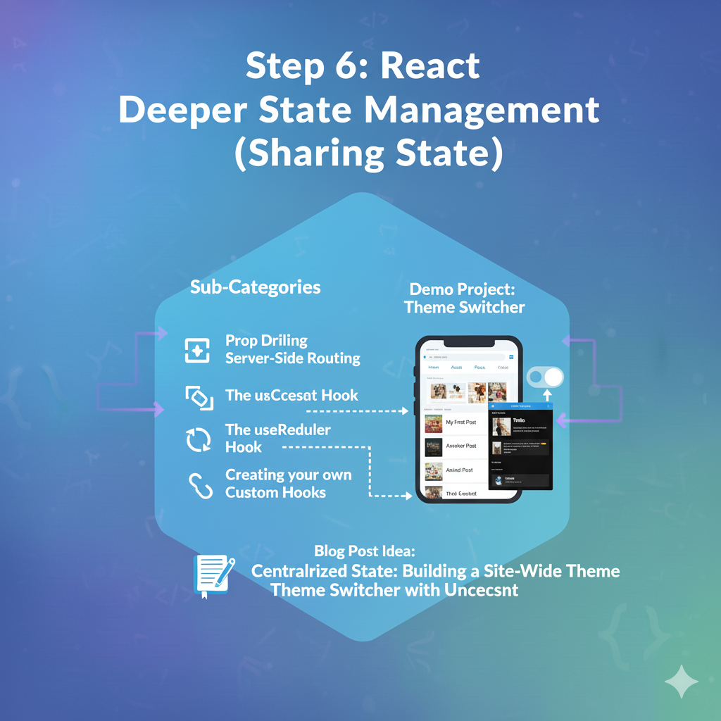
1. 🧠 Key Concept: The Problem of “Prop Drilling”
Imagine your app’s component structure looks like this:
<App>
  <NavBar user={user} />
  <MainPage>
    <WelcomeBanner user={user} />
    <Content>
      <UserProfile>
        <Avatar user={user} />  <-- THIS component needs the user
      </UserProfile>
    </Content>
  </MainPage>
</App>
The <App> component has the user state. But only the <Avatar> component actually needs it.
To get it there, you have to pass the user prop through <MainPage>, <Content>, and <UserProfile>. These components don’t care about the user—they are just passing it along.
This is Prop Drilling. It’s annoying, hard to maintain, and makes your code brittle. If you need to change the user prop, you have to edit 5 different files.
We need a way to “teleport” the user state directly from <App> to <Avatar>.
2. 🧠 Key Concept: useContext – The Solution to Prop Drilling
The useContext hook lets you create a “Context” (think of it as a global data store for one part of your app). Components can “provide” a value to this context, and any child component (no matter how deep) can “consume” or read that value.
It’s a 3-step process:
- Create the Context: You create a “channel” to pass the data.JavaScript
// src/ThemeContext.js import { createContext } from 'react'; export const ThemeContext = createContext(null); - Provide the Value: You wrap a parent component (like your whole
<App>) in a.Providerand give it thevalueyou want to share.JavaScript// src/App.jsx import { ThemeContext }... function App() { const [theme, setTheme] = useState('light'); return ( <ThemeContext.Provider value={{ theme, setTheme }}> {/* Now, all components inside here can access the theme */} <NavBar /> <HomePage /> </ThemeContext.Provider> ); } - Consume the Value: Any child component can now “tune in” to this context using the
useContexthook.JavaScript// src/components/NavBar.jsx import { useContext } from 'react'; import { ThemeContext } from '../ThemeContext'; function NavBar() { // No prop drilling! It magically gets the value. const { theme, setTheme } = useContext(ThemeContext); const toggleTheme = () => setTheme(theme === 'light' ? 'dark' : 'light'); return ( <nav> <button onClick={toggleTheme}> Toggle to {theme === 'light' ? 'Dark' : 'Light'} Mode </button> </nav> ); }
3. 🧠 Key Concept: useReducer – A Better useState for Complex State
So far, we’ve only used useState. It’s great for simple state (numbers, strings, booleans).
But what about complex state? Imagine a shopping cart. You might have logic like:
- Add item (but only if it’s in stock)
- Remove item
- Update quantity (but not higher than stock, and not lower than 1)
- Apply coupon code
If you put all this logic in your component using 5 different useState hooks, it gets messy.
The useReducer hook is an alternative to useState. It’s inspired by Redux and is perfect for managing complex state transitions.
useState: You get thestateand asetStatefunction. You just callsetState(newState).useReducer: You get thestateand adispatchfunction. Instead of saying what the new state is, youdispatchan action (an object describing what just happened, e.g.,{ type: 'ADD_ITEM', payload: 123 }).
This dispatch goes to a central function called a reducer. This one function contains a switch statement that handles all your logic.
JavaScript
// A simple counter, rebuilt with useReducer
import { useReducer } from 'react';

// 1. The Reducer Function: All your logic lives here.
// It takes the current state and an action, and returns the NEW state.
function counterReducer(state, action) {
  switch (action.type) {
    case 'INCREMENT':
      return { count: state.count + 1 };
    case 'DECREMENT':
      return { count: state.count - 1 };
    default:
      throw new Error();
  }
}

function Counter() {
  // 2. Initialize the hook
  const [state, dispatch] = useReducer(counterReducer, { count: 0 });

  return (
    <>
      Count: {state.count}
      {/* 3. Dispatch actions instead of setting state */}
      <button onClick={() => dispatch({ type: 'DECREMENT' })}>-</button>
      <button onClick={() => dispatch({ type: 'INCREMENT' })}>+</button>
    </>
  );
}
Why is this better?
- Centralized Logic: All update logic is in one place (the reducer), not in 20 different click handlers.
- Testable: The reducer is a “pure function.” You can test it easily without even rendering your component.
- Clearer Intent:
dispatch({ type: 'ADD_TO_CART' })is much clearer thansetItems([...items, newItem]).
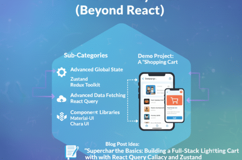
4. 🧠 Key Concept: Custom Hooks – Reusing Logic
This is the most powerful pattern in modern React.
You’ve probably noticed yourself repeating code. A common example is the data-fetching logic from Step 4.
- In
<ComponentA>, you need touseStatefordata,loading, anderror, and auseEffecttofetch. - In
<ComponentB>, you need to… do the exact same thing for a different URL.
A Custom Hook lets you extract this reusable logic into its own function. A custom hook is just a JavaScript function that:
- Starts with the word “use” (e.g.,
useFetch). - Calls other hooks (like
useState,useEffect, oruseContext).
Example: Let’s create useFetch!
JavaScript
// src/hooks/useFetch.js
import { useState, useEffect } from 'react';

// 1. It's just a function that starts with 'use'
export function useFetch(url) {
  // 2. It calls other hooks
  const [data, setData] = useState(null);
  const [isLoading, setIsLoading] = useState(true);
  const [error, setError] = useState(null);

  useEffect(() => {
    async function fetchData() {
      // Reset state for new fetches
      setIsLoading(true);
      setError(null);

      try {
        const response = await fetch(url);
        if (!response.ok) throw new Error(`HTTP error!`);
        const jsonData = await response.json();
        setData(jsonData);
      } catch (e) {
        setError(e.message);
      } finally {
        setIsLoading(false);
      }
    }

    fetchData();
  }, [url]); // Re-fetch if the URL changes

  // 3. It returns the state
  return { data, isLoading, error };
}
Now, our components become incredibly clean:
JavaScript
// src/components/UserProfile.jsx
import { useFetch } from '../hooks/useFetch';

function UserProfile({ userId }) {
  // All that logic is now one clean line
  const { data, isLoading, error } = useFetch(
    `https://api.example.com/users/${userId}`
  );

  if (isLoading) return <p>Loading...</p>;
  if (error) return <p>Error: {error}</p>;

  return <div>Hello, {data.name}</div>;
}
2. 🚀 Demo Project: Theme Switcher (with useContext)
This project is the “Hello, World” for useContext. We’ll make a button that toggles the entire app between Light and Dark mode.
Coding Steps:
Step 1: Create the Theme Context
- Create a new folder
src/context. - Create a new file
src/context/ThemeContext.jsx:JavaScriptimport { createContext, useState } from "react"; // 1. Create the context export const ThemeContext = createContext(null); // 2. Create the Provider component // This component will wrap our app and manage the theme state export function ThemeProvider({ children }) { const [theme, setTheme] = useState("light"); const toggleTheme = () => { setTheme(theme === "light" ? "dark" : "light"); }; // 3. Provide the 'theme' and 'toggleTheme' to all children return ( <ThemeContext.Provider value={{ theme, toggleTheme }}> {children} </Them-Context.Provider> ); }
Step 2: Wrap Your App in the Provider Go to src/main.jsx and wrap your <App /> component.
JavaScript
// src/main.jsx
import React from 'react';
import ReactDOM from 'react-dom/client';
import App from './App.jsx';
import { ThemeProvider } from './context/ThemeContext.jsx'; // 1. Import
import './MyStyles.css';

ReactDOM.createRoot(document.getElementById('root')).render(
  <React.StrictMode>
    {/* 2. Wrap your App */}
    <ThemeProvider>
      <App />
    </ThemeProvider>
  </React.StrictMode>,
);
Now, every component in your app can access the theme.
Step 3: Create the Toggle Button Let’s modify NavBar.jsx (from Step 5) to include the button.
JavaScript
// src/NavBar.jsx
import { Link } from 'react-router-dom';
import { useContext } from 'react'; // 1. Import useContext
import { ThemeContext } from './context/ThemeContext'; // 2. Import your context

export default function NavBar() {
  // 3. Consume the context
  const { theme, toggleTheme } = useContext(ThemeContext);

  return (
    <nav className="navbar">
      <Link to="/">Home</Link>
      <Link to="/about">About</Link>
      <Link to="/posts">Posts</Link>

      {/* 4. Use the context values! */}
      <button onClick={toggleTheme} className="theme-toggle-btn">
        Switch to {theme === 'light' ? 'Dark' : 'Light'} Mode
      </button>
    </nav>
  );
}
Step 4: Make Your App Respond to the Theme Let’s make the whole app’s background change.
JavaScript
// src/App.jsx
import { Routes, Route } from 'react-router-dom';
import { useContext } from 'react'; // 1. Import
import { ThemeContext } from './context/ThemeContext'; // 2. Import
// ... other imports

function App() {
  // 3. Consume the context
  const { theme } = useContext(ThemeContext);

  // 4. Apply the theme as a class name
  return (
    // This div will have class "app-container light" or "app-container dark"
    <div className={`app-container ${theme}`}>
      <NavBar />

      <div className="page-content">
        <Routes>
          {/* ... your routes ... */}
        </Routes>
      </div>
    </div>
  );
}

export default App;
Step 5: Add the CSS Open src/MyStyles.css and add this at the end:
CSS
/* src/MyStyles.css */

/* Light Mode (default) */
.app-container.light {
  background-color: #f0f2f5;
  color: #333;
}
.app-container.light .navbar {
  background-color: #eee;
}
.app-container.light .navbar a {
  color: #333;
}
.app-container.light .page-content {
  background-color: #ffffff;
  color: #333;
}

/* Dark Mode */
.app-container.dark {
  background-color: #121212;
  color: #e0e0e0;
}
.app-container.dark .navbar {
  background-color: #1e1e1e;
}
.app-container.dark .navbar a {
  color: #e0e0e0;
}
.app-container.dark .page-content {
  background-color: #1e1e1e;
  color: #e0e0e0;
}

.theme-toggle-btn {
  margin-left: auto; /* Pushes button to the right */
  padding: 8px 12px;
  cursor: pointer;
  border: none;
  border-radius: 5px;
}
Result: You’ll have a fully-functional multi-page app, and the button in your NavBar will toggle the theme for the entire application without any prop drilling.